¡El Movimiento Vivo!
¡El Movimiento Vivo!:
Chicano Roots of
el Día de los Muertos
at Oakland Museum of California
ROLE: lead graphic designer
SCOPE: branding, timeline 2D+3D design, product consultation, hierarchy / label system, typesetting, consultant
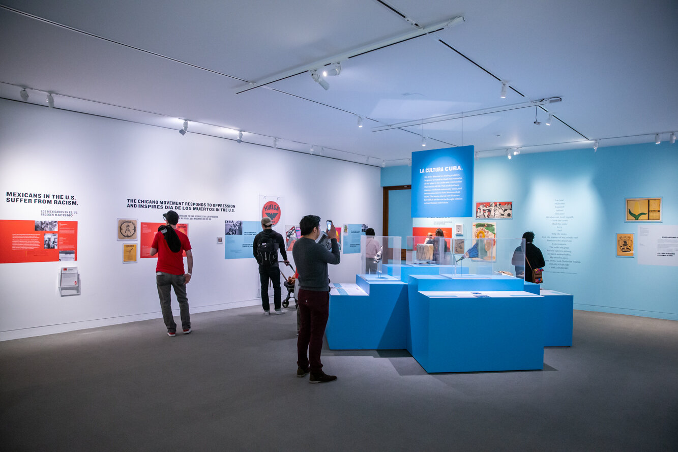
¡El Movimiento Vivo! focused on the history of Día de los muertos in California as a legacy of celebration and activism. Bilingual and tightly constrained, this show featured artifacts and newly-commissioned artworks alongside personal stories.
Limitations imposed for this show were multifold. To ease installation efforts, I developed panels of information which were overlaid with objects and highlighted by titling and quotes. Colors were drawn from existing items of the time period. Typography included the dictated use of Knockout — which I modified in the exhibition identity — and paired with Freight and Freight Sans to differentiate languages further down in the hierarchy. Commissioned illustrations by Ven Voisey taught a remembrance activity without the need for words.
Full translations were keyed to each section, and developed alongside the space design artfully.
The tone of the show was hope, pride, justice, and reverence.
Vibrant and alive
For over ten years, I’ve been designing the Oakland Museum of California’s annual Día de los muertos-oriented exhibitions. It has been incredibly rewarding and challenging to learn about and honor the cultures through choices that support artist and curatorial intentions. For ¡El Movimiento Vivo!, the focus was on brilliant activism and the art inspired by the movement to take pride in ones’ heritage.
The word vivo means alive, clever, and intense. These words dictated strong brand colors that hearkened back decades to the movement’s inception. The leathery cardstock texture added depth and familiarity to collaged images and newspaper-adjacent typography. These contextual clues assist the viewer in recognizing the historical stories and tap into the feelings from those eras.
¡El Movimiento Vivo! logotype
The mark for ¡El Movimiento Vivo! is a customized treatment of Knockout, with variations for stacked, horizontal, all Spanish, and superwide. Using historical artifacts as inspiration, I added movement, tradition, and flavor to a lockup that prominently features an inverted exclamation point and an extensive subhead.


